
Introduction
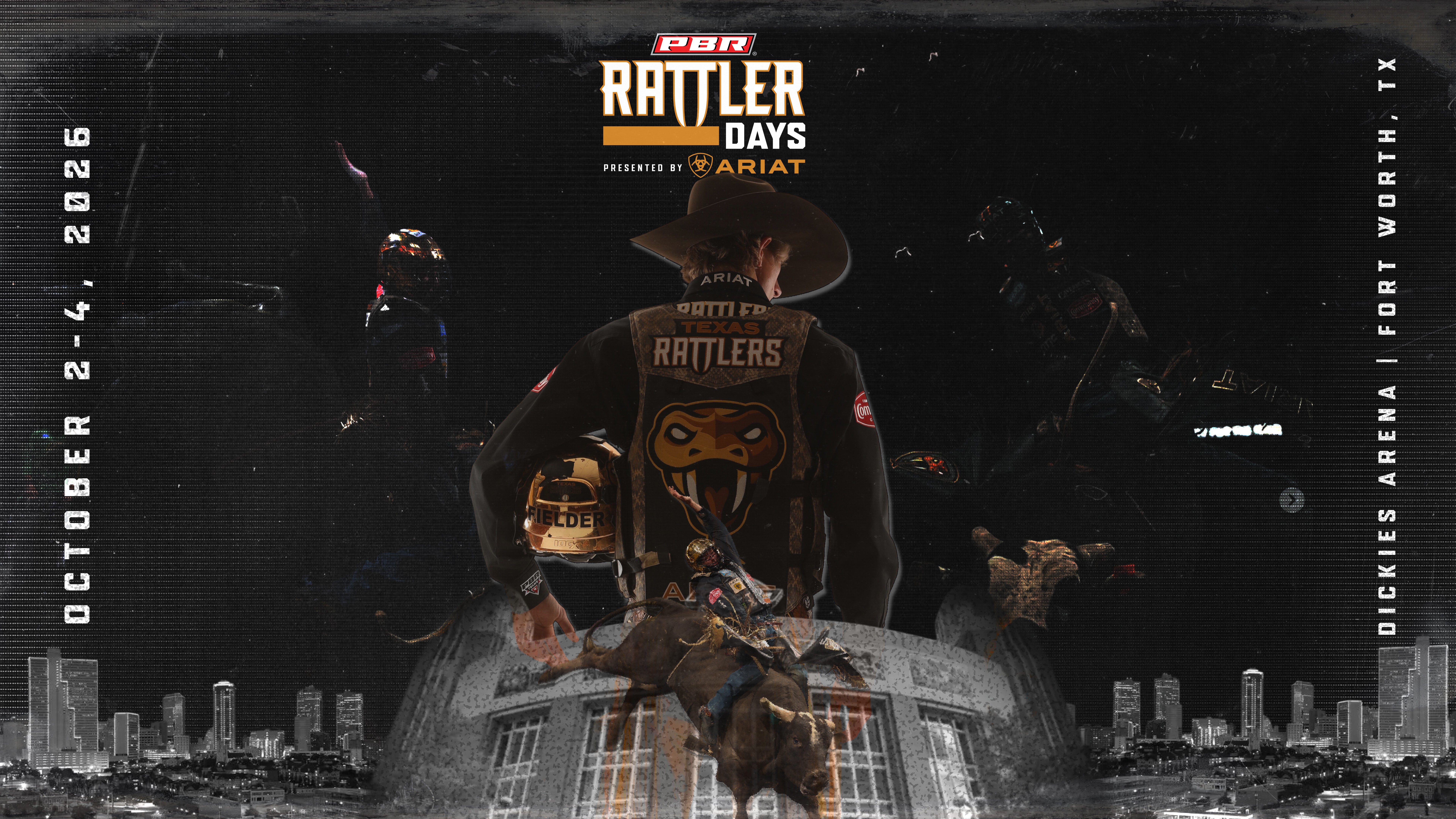
Texas Rattlers is a professional bull-riding team under PBR, known for its energy, bold identity, and loyal fan culture. As part of their digital evolution, the goal was to elevate their Instagram presence — turning static updates into high-impact visuals that deepen fan loyalty, build brand recognition, and support ticket & merchandise sales.
My responsibility was to design a series of social media graphics for Instagram that align with the team’s competitive spirit, event schedule, and athlete storytelling — while keeping brand consistency strong across formats.

Challenge
Texas Rattlers’ Instagram content needed:
Stronger visual identity
More recognizable brand language
Higher engagement and shareability
Graphics that could communicate event info quickly
A look that feels “Texas tough,” modern, but fan-friendly
The challenge was building a scalable graphic system — not just isolated posts — something that could evolve game-to-game and season-to-season.
Solution & Design Approach
1. Brand Positioning
I defined visual direction around three core pillars:
Fearless – bold typography, high contrast
Texas grit – textures, edges, western cues
Premium sports feel – motion blur, dramatic scale, pro-sport visual hierarchy
2. Color & Typography
Core colors: Black, Rattler Green, White + Sand Neutral
Supporting accents: metallic silver/bronze, subtle gold tones
Typography: strong condensed san-serif for headlines + readable secondary fonts
3. Consistent Layout System
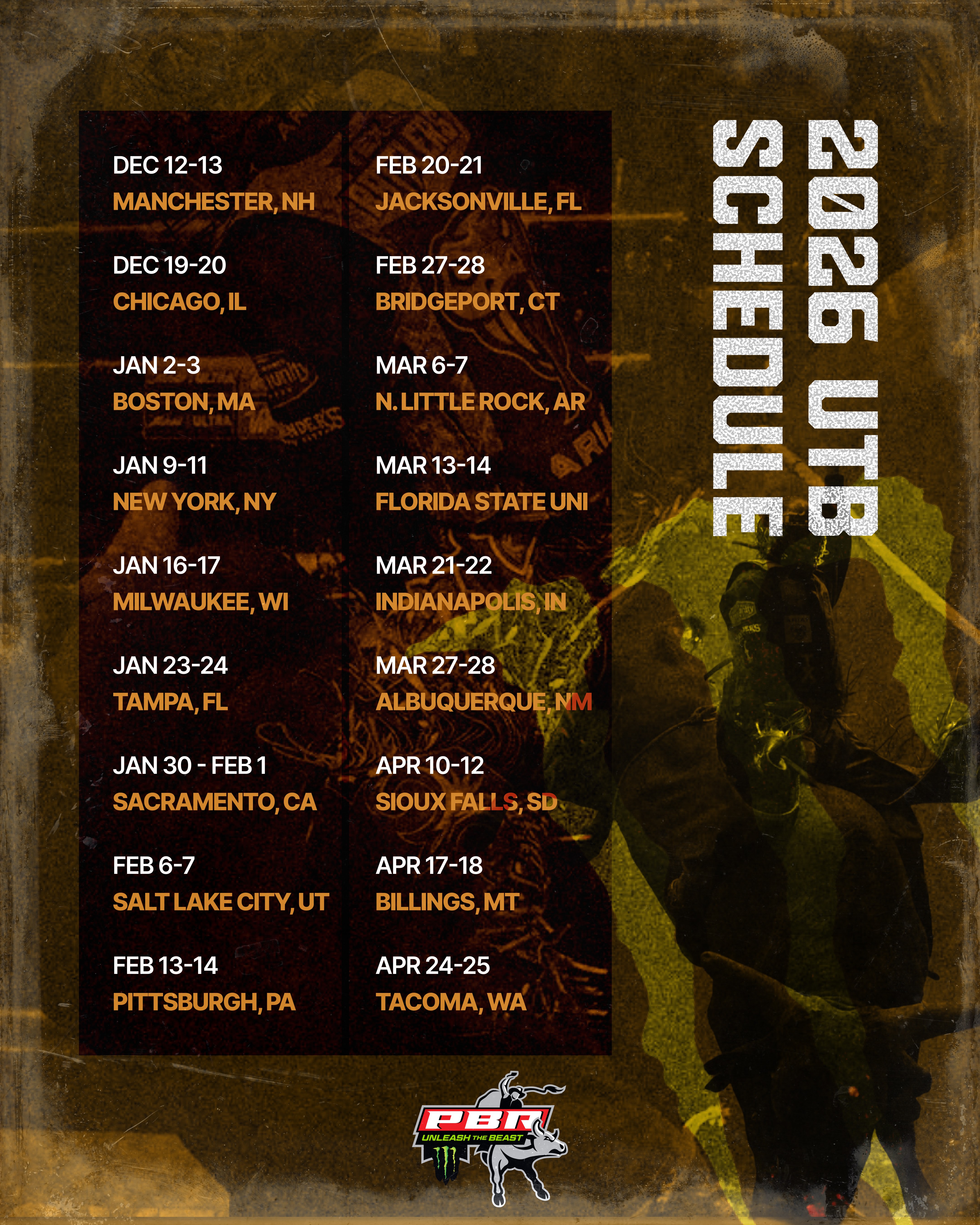
I established templates for:
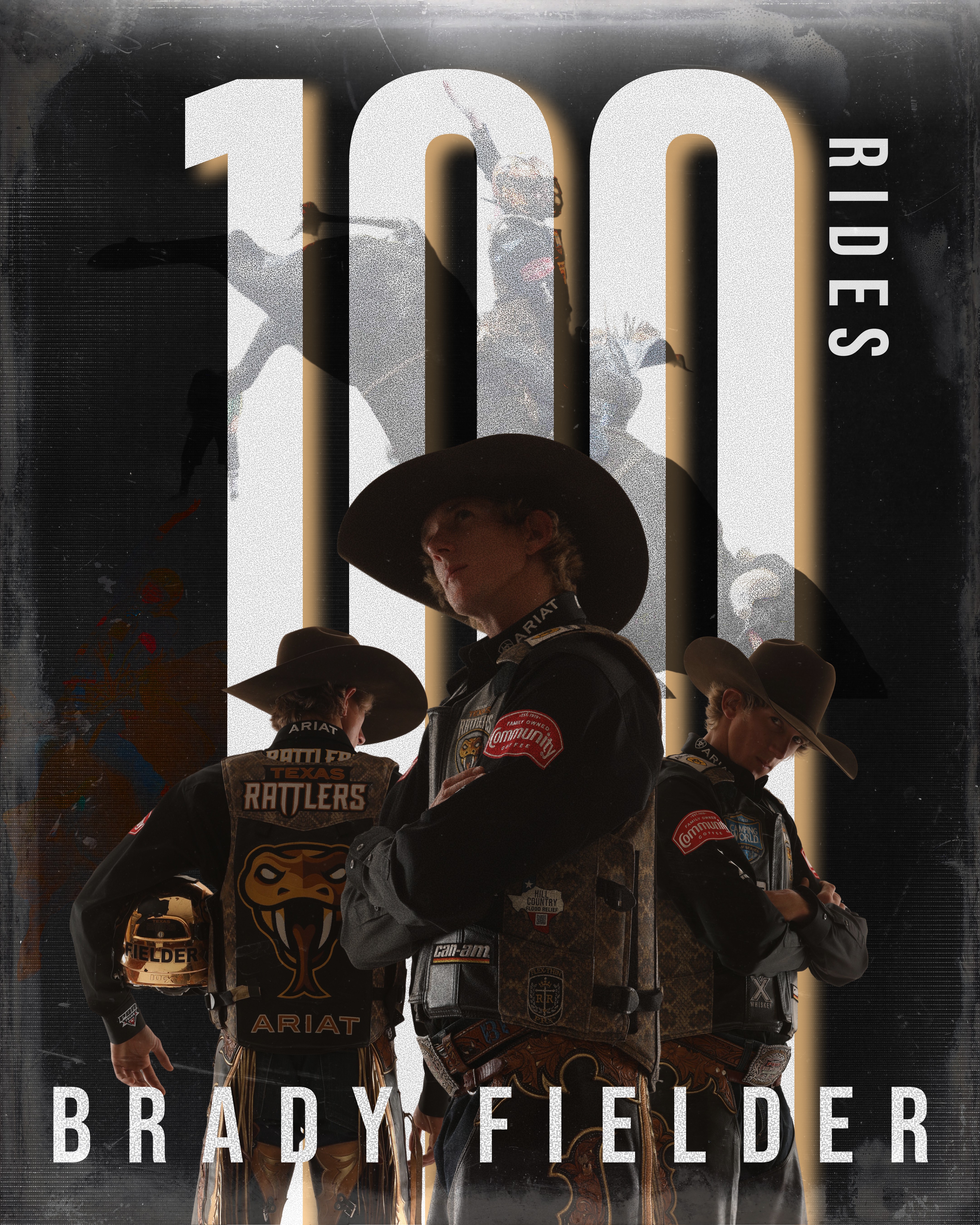
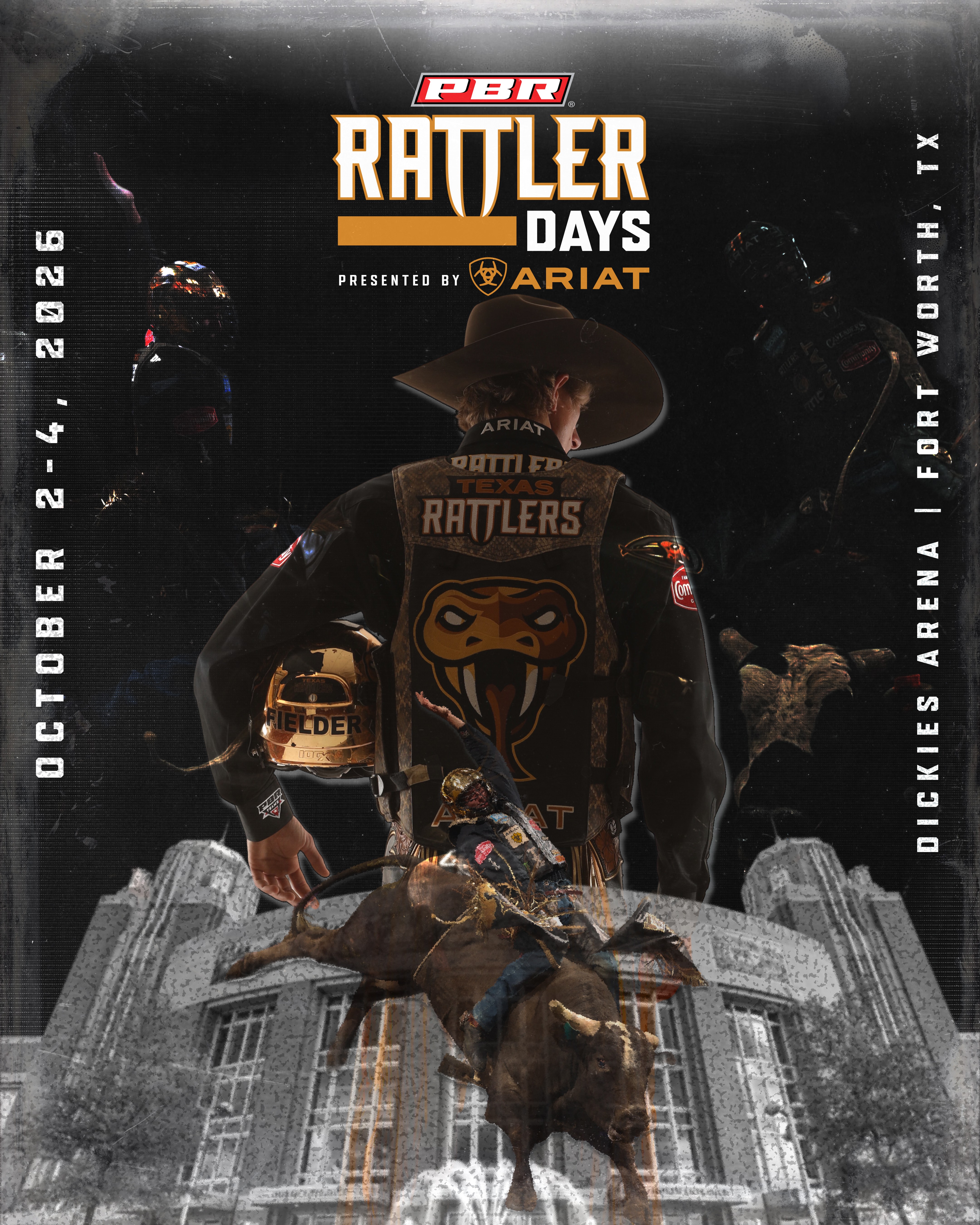
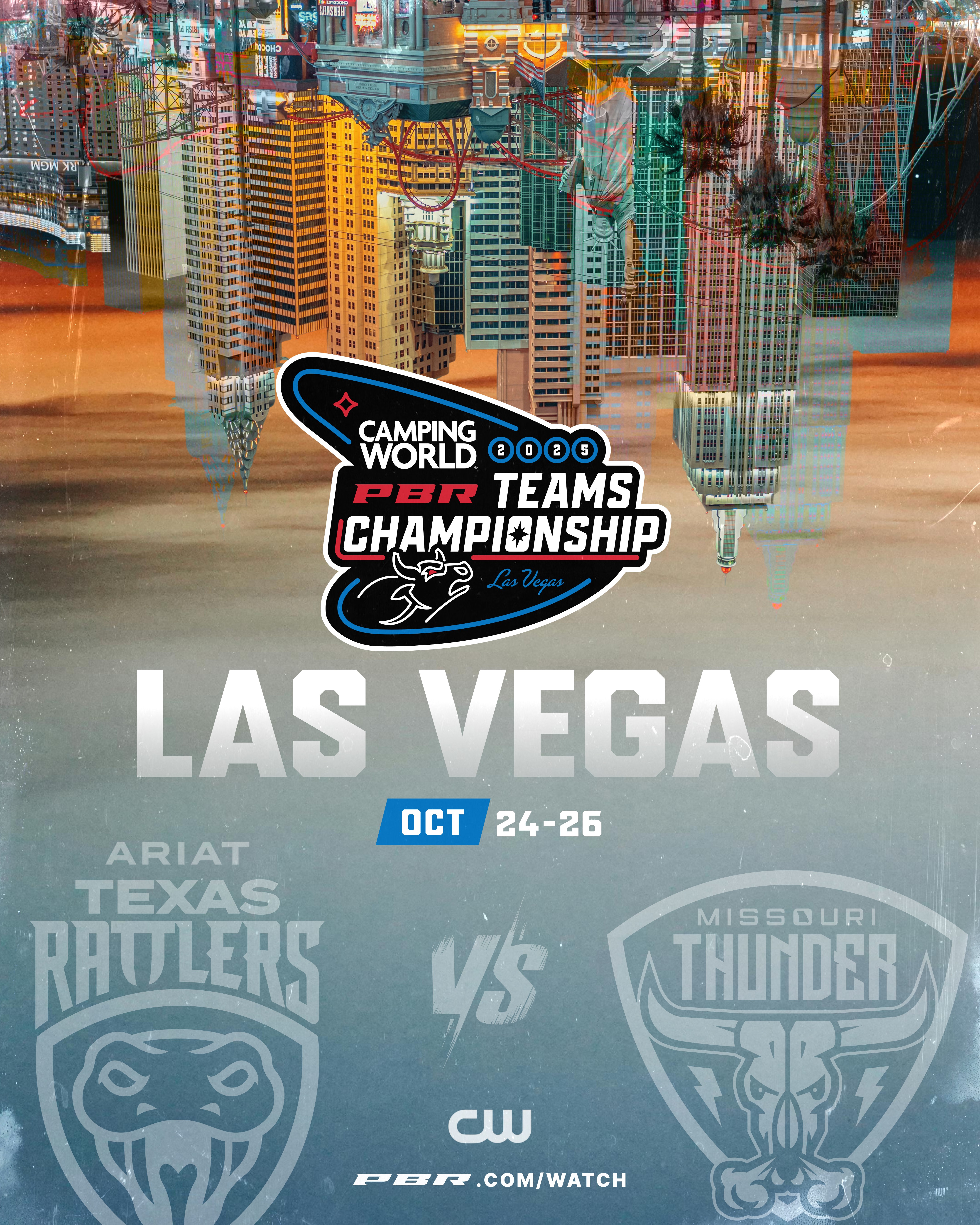
Event announcements
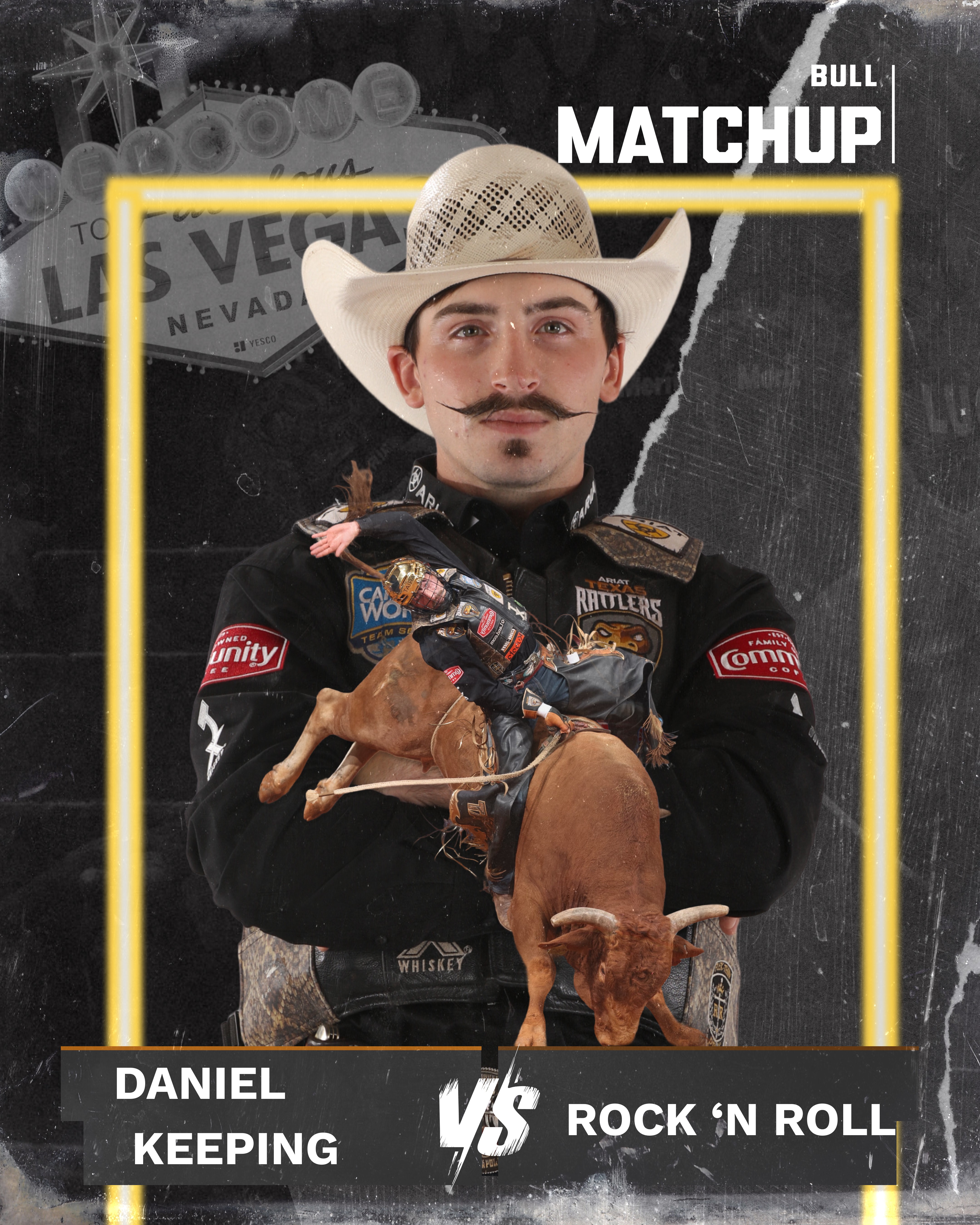
Rider highlights
Score results
Countdown graphics
Hype motion stills
Fan-engagement/UGC layouts
All built to be flexible but recognizable at a glance.

4. Texture & Motion Language
Inspired by Rattlers energy, I added:
Crocodile / snake-skin textures
Dust and grit overlays
45° angled photo crops for movement
Subtle 3D-lean visual depth for drama
These contributed to a cohesive, memorable sports aesthetic.
5. Workflow & Iteration
Iterations based on team feedback & game cadence
Social testing — evaluating which formats produce more shares/saves
Impact
The redesigned visual identity led to:
Stronger post recognition — fans beginning to identify "Rattlers visuals"
Improved engagement on matchup & announcement posts
Easier content production workflow for the team
A scalable system ready for playoffs, merch campaigns, and partnerships
The graphics also contributed to:
Consistent storytelling around riders
Higher perceived brand value
Real-world usage during live events and sponsor promotions
Conclusion
By merging Western grit with modern sports aesthetics, I transformed Texas Rattlers’ Instagram presence into a recognizable, energetic visual system. What started as individual design requests evolved into a branded ecosystem — one that supports athlete promotion, fan engagement, and marketing growth.
This case study reflects my ability to not only design visually striking graphics but also build scalable identity frameworks that drive engagement and communicate brand spirit.


